Building a Next-Gen UI Kit Using CSS Custom Properties
Scalable Theming, Dynamic UI, and Modern Design Systems
Introduction
Modern frontend development is no longer about writing isolated CSS files and static UI components.
Today’s interfaces must be scalable, theme-aware, and dynamic while maintaining performance and design consistency.
This is where CSS Custom Properties (CSS Variables) shine.
In this blog, we will build a modern UI kit architecture using CSS Custom Properties that supports:
Centralised design tokens
Live theme switching (light/dark)
Clean UI/UX separation
Minimal JavaScript
Production-ready scalability
This approach is widely used in modern SaaS dashboards, design systems, and component libraries.
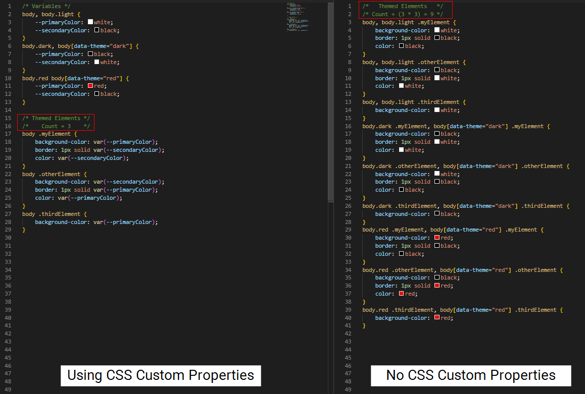
What Are CSS Custom Properties?
CSS Custom Properties are runtime CSS variables that live in the browser, not during build time.
:root {
  --primary-color: #6366f1;
  --background-color: #ffffff;
}
Unlike Sass or Less variables, CSS Custom Properties:
Can be updated dynamically
Cascade like normal CSS
Can be modified using JavaScript
They are perfect for theming and design systems
Why Modern UI Kits Use Design Tokens
Design tokens are single sources of truth for UI values like:
Colors
Spacing
Typography
Border radius
Shadows
Instead of hardcoding values repeatedly, components reference tokens.
This makes UI kits:
Easier to maintain
Easier to redesign
Easier to scale
Defining Design Tokens (Foundation Layer)
We start by explaining all visual values in one place.
/* Design Tokens */
:root {
  /* Colors */
  --color-primary: #6366f1;
  --color-secondary: #22c55e;
  --color-danger: #ef4444;

  /* Backgrounds */
  --bg-primary: #ffffff;
  --bg-secondary: #f9fafb;

  /* Text */
  --text-primary: #111827;
  --text-secondary: #6b7280;

  /* Spacing */
  --space-xs: 4px;
  --space-sm: 8px;
  --space-md: 16px;
  --space-lg: 24px;

  /* Border Radius */
  --radius-sm: 6px;
  --radius-md: 10px;

  /* Shadows */
  --shadow-md: 0 10px 25px rgba(0, 0, 0, 0.08);
}
UX Impact:
Changing one token updates the entire UI instantly.
Base Styles Using Tokens
Base styles ensure consistency across all components.
body {
  background-color: var(--bg-primary);
  color: var(--text-primary);
  font-family: system-ui, sans-serif;
  margin: 0;
}

button {
  font-family: inherit;
}
This ensures your UI kit feels cohesive and professional.
Building Reusable UI Components
Button Component
.btn {
  padding: var(--space-sm) var(--space-md);
  border-radius: var(--radius-md);
  border: none;
  background-color: var(--color-primary);
  color: white;
  cursor: pointer;
  box-shadow: var(--shadow-md);
  transition: transform 0.2s ease, background-color 0.2s ease;
}

.btn:hover {
  transform: translateY(-2px);
}
Card Component
.card {
  background-color: var(--bg-secondary);
  padding: var(--space-lg);
  border-radius: var(--radius-md);
  box-shadow: var(--shadow-md);
}
Notice how no raw values are used — only tokens.
Creating Multiple Themes (Dark Mode)
Instead of rewriting components, we override tokens.
[data-theme="dark"] {
  --bg-primary: #0f172a;
  --bg-secondary: #020617;
  --text-primary: #e5e7eb;
  --text-secondary: #94a3b8;
  --color-primary: #818cf8;
}
This single block controls the entire dark theme UI.
Live Theme Switching with JavaScript
We toggle themes using a single HTML attribute.
const toggleButton = document.querySelector("#themeToggle");

toggleButton.addEventListener("click", () => {
  const currentTheme = document.documentElement.getAttribute("data-theme");
  const newTheme = currentTheme === "dark" ? "light" : "dark";

  document.documentElement.setAttribute("data-theme", newTheme);
  localStorage.setItem("theme", newTheme);
});

// Load saved theme
const savedTheme = localStorage.getItem("theme");
if (savedTheme) {
  document.documentElement.setAttribute("data-theme", savedTheme);
}
Result:
Instant UI update without reload or re-render.
Complete HTML Example (Everything in One File)
<!DOCTYPE html>
<html lang="en">
<head>
  <meta charset="UTF-8">
  <title>Next-Gen UI Kit</title>

  <style>
    :root {
      --color-primary: #6366f1;
      --bg-primary: #ffffff;
      --bg-secondary: #f9fafb;
      --text-primary: #111827;
      --radius-md: 10px;
      --shadow-md: 0 10px 25px rgba(0,0,0,0.08);
    }

    [data-theme="dark"] {
      --bg-primary: #0f172a;
      --bg-secondary: #020617;
      --text-primary: #e5e7eb;
      --color-primary: #818cf8;
    }

    body {
      background: var(--bg-primary);
      color: var(--text-primary);
      font-family: system-ui, sans-serif;
      padding: 40px;
    }

    .btn {
      padding: 10px 16px;
      border-radius: var(--radius-md);
      border: none;
      background: var(--color-primary);
      color: white;
      cursor: pointer;
      box-shadow: var(--shadow-md);
    }

    .card {
      background: var(--bg-secondary);
      padding: 24px;
      margin-top: 24px;
      border-radius: var(--radius-md);
      box-shadow: var(--shadow-md);
    }
  </style>
</head>
<body>

  <button id="themeToggle" class="btn">Toggle Theme</button>

  <div class="card">
    <h2>Next-Gen UI Kit</h2>
    <p>Powered by CSS Custom Properties</p>
  </div>

  <script>
    document.getElementById("themeToggle").addEventListener("click", () => {
      const theme =
        document.documentElement.getAttribute("data-theme") === "dark"
          ? "light"
          : "dark";
      document.documentElement.setAttribute("data-theme", theme);
    });
  </script>

</body>
</html>
UI/UX Benefits of This Architecture

No duplicated CSS
Centralised design control
Easy white-labeling
Smooth designer–developer collaboration
Framework-agnostic
Performance & Scalability
Zero layout reflow
No CSS recompilation
Native browser support
Works with React, Next.js, Vue, or Vanilla JS
This makes it production-ready and future-proof.
When to Use This UI Kit Pattern
SaaS dashboards
Portfolio systems
Design systems
Component libraries
Client white-label products
Final Thoughts
CSS Custom Properties are no longer optional in modern frontend development.
They enable UI systems that are:
Dynamic
Maintainable
Performant
Scalable
If you want to build professional, modern UI kits, this approach is essential.
🚀 Your frontend architecture just levelled up.